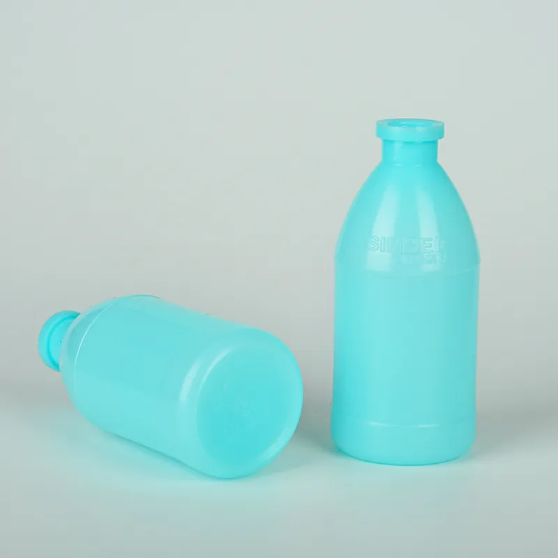
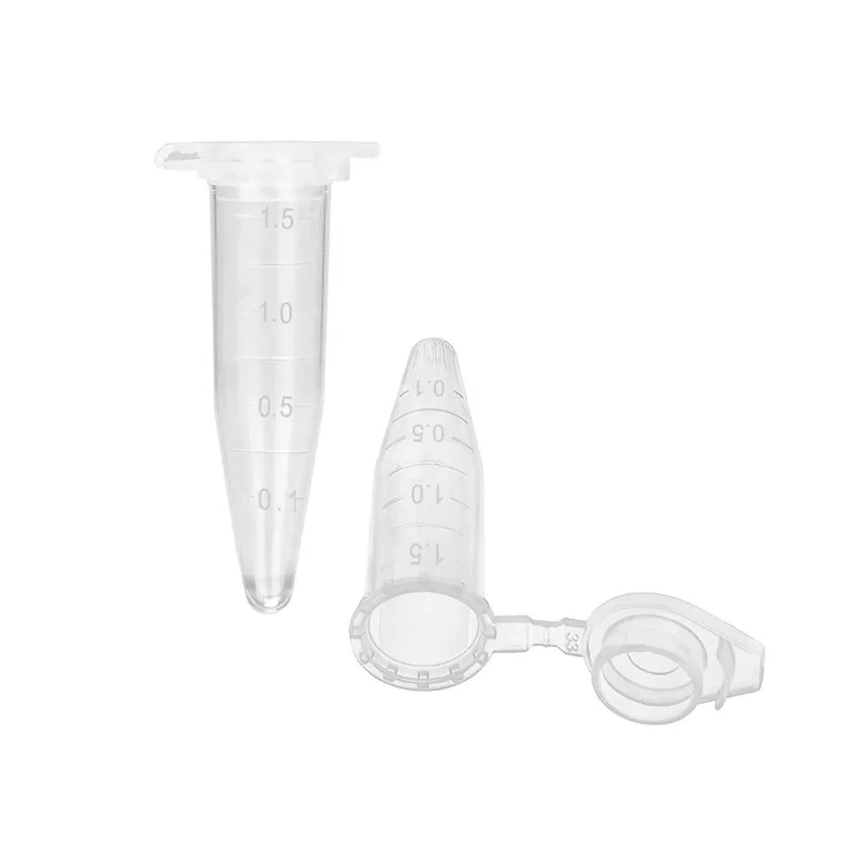
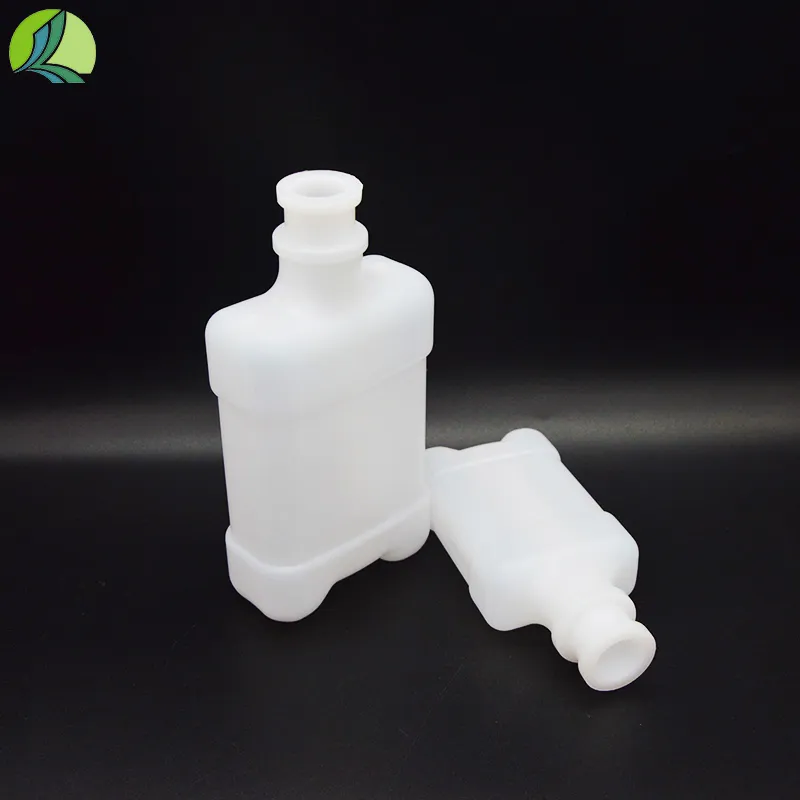
medicine bottle label design
The Importance of Medicine Bottle Label Design
In the realm of pharmaceuticals, the design of medicine bottle labels is crucial for both patient safety and effective communication. Labels serve as the first point of interaction between the patient and the medication. Therefore, a well-designed label not only provides essential information but also enhances adherence to medication regimens. This article delves into the significance of medicine bottle label design, focusing on its key components, the challenges involved, and best practices for effective label creation.
One of the primary functions of a medicine bottle label is to convey critical information about the medication inside. This includes the drug name, dosage, administration instructions, expiration date, and any warnings or precautions. The clarity of this information is paramount; illegible or poorly designed labels can lead to medication errors, adverse effects, or even serious health complications. Thus, utilizing clear fonts, appropriate text sizes, and contrasting colors can greatly enhance readability. According to studies, labels that follow design principles for better visibility can reduce the chances of misinterpretation and misuse.
In addition to clarity, the organization of information on the label is equally important. Essential details should be prioritized and placed in a logical order. For instance, the drug name should be the most prominent feature, followed by dosing instructions. Warnings and side effects can be listed in smaller font but still remain easy to find. A logical flow ensures that patients can quickly access the information they need, especially in emergencies when time is of the essence.
medicine bottle label design

Moreover, incorporating visual elements such as icons or symbols can significantly enhance the effectiveness of a medicine label. For example, using a pill bottle symbol to indicate dosage frequency or a red triangle to signal a warning can quickly communicate important messages to users, regardless of their reading ability or language proficiency. Such universal design elements cater to a wide range of patients, including those with limited literacy or those who may speak languages other than English.
However, creating an effective medicine bottle label comes with its own set of challenges. Regulatory requirements can vary significantly across different regions, dictated by governmental health organizations. These regulations often specify what must be included on a label, which can lead to overcrowding and a lack of space for legible design. Striking a balance between compliance and clarity can be difficult. Furthermore, the need to accommodate patients with varying levels of health literacy adds an additional layer of complexity.
To address these challenges, pharmaceutical companies are encouraged to engage in user-centered design processes when creating labels. This involves conducting research to understand how patients interact with medication labels and identifying common points of confusion. Involving patients in the design process can provide invaluable insights and result in labels that truly meet their needs. Feedback from healthcare professionals can also play a crucial role, as they can offer invaluable perspectives on how patients interpret labels in real-world settings.
In conclusion, the design of medicine bottle labels is an essential aspect of pharmaceutical care that directly impacts patient safety and adherence to medication. By prioritizing clarity, organization, and universal design principles, pharmaceutical companies can create effective labels that empower patients and reduce the risk of medication errors. Engaging in user-centered design and considering regulatory requirements can make the label design process not only compliant but also patient-friendly. As the healthcare landscape continues to evolve, the importance of thoughtful medicine bottle label design remains a critical element of effective patient communication and safety.
-
Aesthetic Makeup Spray Bottles | Fine Mist Empty RefillableNewsAug.19,2025
-
White Plastic Veterinary Vaccine Vials | Lab Liquid BottlesNewsAug.18,2025
-
Plastic Medicine Liquid Bottle: Secure Flip Top Drug VialsNewsAug.17,2025
-
Durable 250ml Blue Plastic Vaccine Vial for Lab & Vet UseNewsAug.16,2025
-
Sterile Virus Sample Tubes: Secure & Reliable Specimen CollectionNewsAug.15,2025
-
White 250ml Plastic Vaccine Vial for Lab & Vet MedicineNewsAug.14,2025


